[DevUx] Zeplin vs InVision? The best tool for design handoff
Yu Ling Cheng10 min read

Zeplin vs InVision: I work for a service company as a lead developer and we have been using these tools on different projects for mockup integration. I teamed up with France Wang, lead designer at BAM, to list the pros and cons and give you our combined point of view on these design handoff tools.
To clarify the need we have on our projects and what we use these platforms for, here is our development workflow:
- Designers make the mockups on Sketch
- They import the mockup on Zeplin or InVision along with the assets
- (They add comments for developers to explain specific behaviors)
- Devs use the platform to inspect mockups and integrate them
Usually, there is a back-and-forth between devs and designers during the mockup integration phase (4). Choosing the best tool helps to limit these wastes and frustrations. We focus on these goals for the benchmark. We’ll also share tips on how we use these tools for better collaboration.
Disclaimer: this content is not sponsored by either mentioned parties
And the best tool for mockup integration is…

After benchmarking the two solutions, our recommendation would be to use Zeplin, as it is more advanced and more convenient for design handoff.
If you have the budget (17$-26$/month) do not hesitate! The time you’ll save is worth it. The platform eases knowledge sharing between designers and developer. Consequently, the production workflow will be faster and less painful. Happier collaboration yay \o/! #DevUx
If you need prototyping and do user testing, use InVision in addition. Designers can use the same Sketch file for both platforms. Separate tools for separate purposes!
Detailed Benchmark of Zeplin vs Invision
Here is a recap of the comparison we made:
![]()
![]()
Zeplin’s Pros:
- Killer features:
- Automatically-generated style guide linked to the mockups
- Commenting tool
- Pixel perfect comparison
- Most complete tool for mockup integration
InVision’s Pros:
- An interesting free plan (as many collaborators as you want)
- More complete offer if you need prototyping
- Will get the job done
Zeplin’s Cons:
- Plans are more expensive and free plan less interesting if you want several collaborators
InVision’s Cons
- Overall less efficient because the platform is multipurpose and the UX is not focused on mockup integration.
Killer feature: Semi-automatically generated style guide
Why should you use a style guide?
Using a style guide helps us save time and limit rework. To both designers and developers, the style guide defines a design reference (for both UI and UX).
For the designers, it helps with
- keeping the product consistent
- summarising all colors, font styles, components used throughout the app along as their states (idle, disabled, active, loading, success, error…) and variations (primary, secondary, icon only, etc…)
- explaining to the devs each component behavior without having to repeat it on each mockup
For developers, it serves as
- a reference of standard color codes, font sizes, font weights to use in the code
- a library of components with the variations and states they can have
- a compilation of components behavior so as not to forget any cases
Style guides on Zeplin vs Invision: why Zeplin wins
Zeplin integrates an interface to create a style guide from imported mockups. The platform detects font properties and colors so the designers can add them to the style guide easily.
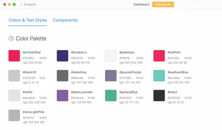 Designers can add colors to the style guide in one click from the mockup and define a name for each
Designers can also export individual Sketch Symbols, which will then appear in the style guide Components section.
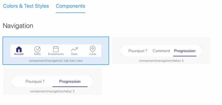 These components are reused by the designer on several mockups. You can see how the navigation looks like with 2 and 3 tabs.
Components and mockup are linked: on the style guide, the developer can see which mockups use which components. Reciprocally, the developer can also see on each mockup which components are used and can click the link to see different component states.
 A link to the component style guide from a mockup on Zeplin
Designers can also share their style guide publicly to get visibility and reactions.
On InVision, if you want a style guide you will need to create one from scratch in Sketch. Consequently, there are no links between the style guide and the mockups, so it is less maintainable (or takes too much time to maintain) and is less visible for the team.
Commenting on the mockup to clarify the integration
Comments are an essential feature to hand over extra information not visible on the mockup or the inspector. They also allow covering edge cases. Is it scrollable? Vertically centered? Is the size proportional? These pieces of information should be left by the designers for the developer to use on integration.
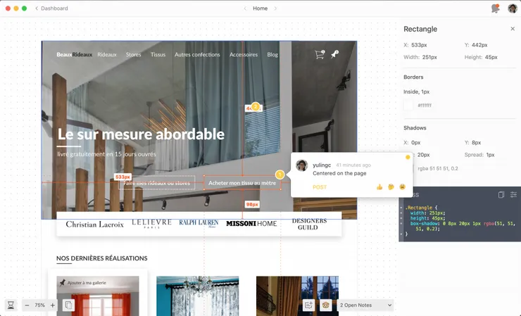 Comments on Zeplin are visible when the developer inspects elements
What makes it best on Zeplin is that comments are visible by default on the inspector’s page. On InVision they are on a separate page, and the users need to switch between modes. So they can forget they exist. What a pity :(
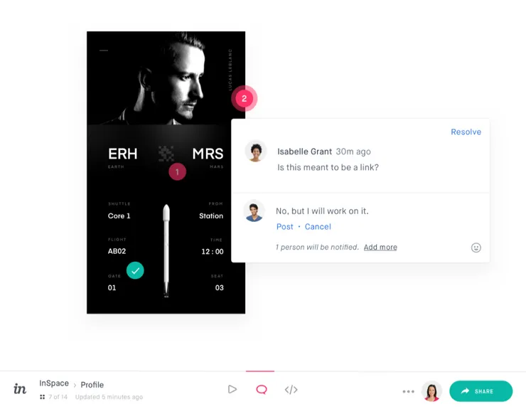 Comments on InVision are on a separate page as the Inspector
Small plus, Zeplin lets you categorize your comments. However, the links you attach are not always clickable (is it a bug?)
Another killer feature for pixel perfect integration
(Only on Mac) With the Zeplin desktop app, you can generate a transparent overlay of the design to compare to the actual development. Of course, if you don’t need this level of accuracy it’s just a wow feature ;)
This helps the dev checking that their integration matches exactly the mockup, for the desired screen sizes.
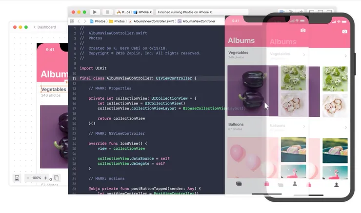 Pop out the mockup in a transparent window and move it over your app to check for differences
CSS properties inspection
This is a basic feature that both platforms allow, but here is what makes Zeplin slightly better:
- The inspector’s panel is more condensed because null properties are hidden. So you can check properties more easily without having to scroll down
- CSS has syntaxic coloration
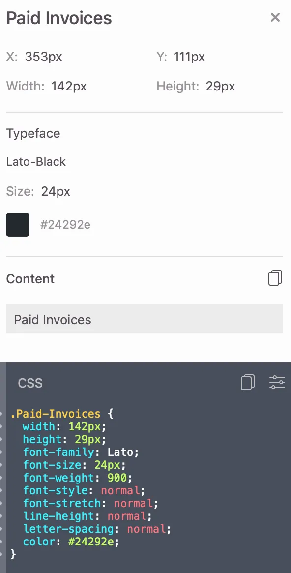 Zeplin inspector
 InVision inspector: opacity and left alignment are not useful to have here as these are default values
Padding/margin inspect
In this battle of Zeplin vs Invision, this is the only round where Zeplin loses!
Designers create groups of elements in Sketch to have blocks containing a label and its value for instance, or an input with its submit button - just like developers might build their app. Designers use these groups to place blocks on the mockup and build a screen.
We tried a little experiment on both platforms. The designer made a table with header and values on Sketch.
 Here is what you can see on InVision’s inspector tab
We uploaded the Sketch file on InVision. Above is what we could see in the inspector: we were able to select the ‘Group 5’ containing the invoice number and its value ‘01_000001’. So by hovering the adjacent block, we could see the margin in between (48px).
 Zeplin’s mockup inspection panel
Then we uploaded the same sketch file on Zeplin: the Sketch groups are not replicated on the inspector platform: you cannot select the container blocks, only the text elements. Therefore, devs cannot see the spacing between blocks easily. They lose the designer’s previous reflection on block cutting and spacing. It’s too bad to have two people do the same work twice!
The downside of user groups, on the other hand, is that it makes small details inspection harder. By experience, InVision’s inspector cursor is less accurate because you hover the groups before the element. You need to zoom in for more accuracy.
Managing Assets
Managing assets is equivalent to both platforms. Once the designer has set the export options in Sketch, the developer can download it from the inspect page when inspecting an element.
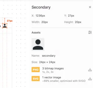 Zeplin vs Invision: on both, developers can pick the file format they want from the available list
You can find the list of downloadable assets in a specific section.
On InVision, you can see the downloadable assets in the group panel.
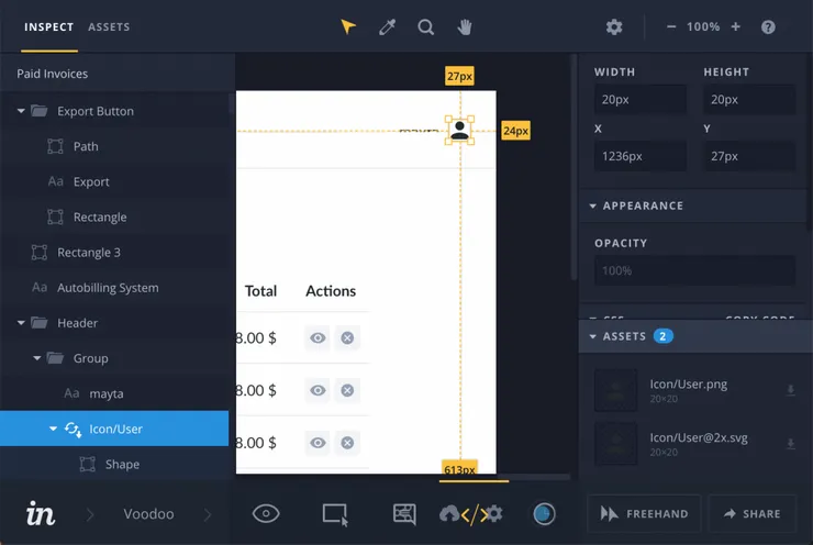 Icon inspection on Invision: on the left panel you can see that the Icon/User is downloadable.
Prototyping
Why many choose InVision is because you can make clickable mockups to navigate from a screen to another. You can test the prototype with the targeted users. Very handy to get feedback before development starts!
The downside of using InVision both for prototyping and integration comes when several version of the same mockup conflict. This can occur when mockups include features under the testing phase. It gets confusing for the developers.
Pricing (updated 27/11/18)
Free tier: 1 project, no collaboration
If you are a service company with several clients, your clients cannot create an account and invite you on their project, you’ll need to disconnect and connect to the same account.
Starter: 17$/mo 3 projects - unlimited collaborators
Growing business: 26$/mo - 17 projects - unlimited collaborators
Organization: from 122$/mo with only 16 collaborators, +7$/mo per extra collaborator
Free tier: 1 project - unlimited collaborators
Starter: 15$/mo - 3 prototypes
Growing business: 25$/mo - unlimited prototypes
Team: 99$/mo unlimited prototypes but only 5 members
Custom: on demand
To go further into benchmarking
Some other tools like Avocode would also need our attention, notably because of their powerful assets export feature. Framer’s new FramerX tool is also an important player we should pay attention too. Their Beta version is not collaborative yet like Invision or Zeplin, but their prototyping tool based on React components is promising.
We at Theodo are building our custom Sketch plugin in order to make it even faster to integrate a component.
With Overlay, we can export components from Sketch and get prod ready React/VueJs code.
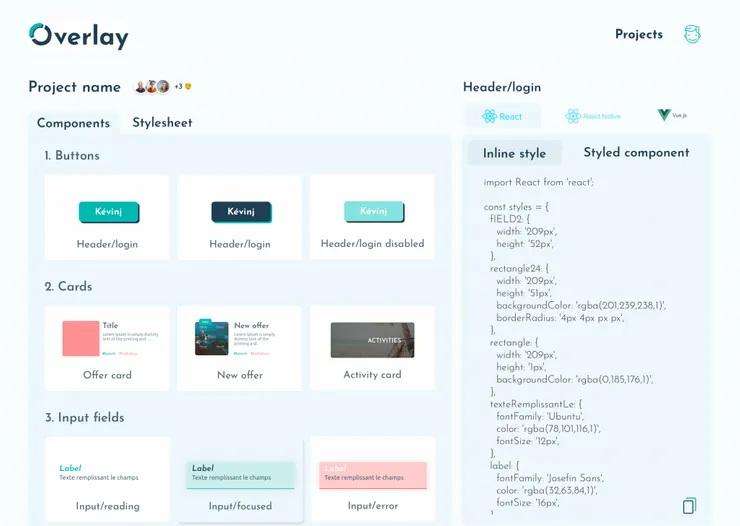 Generate React.js/Vue.js components with full design from Sketch files with Overlay plugin
Conclusion
All in all, these tools will increase your mockup integration process. Nonetheless, the difference lies in subtle details and better user experience. That’s what gives Zeplin the edge over InVision.
Having developers and designers working together is not easy. Indeed, each profile has its own stakes and think differently. We have a lot to learn from each other to deliver the best products. Integrating the right tool in our process will make the collaboration much smoother.
France and I have been working together to spread the DevUx culture (yes, DevOps is not the only one). This goes from understanding each other, defining mutual expectations and design collaboratively. More articles are coming!
Don’t hesitate to share your experience and tips using these tools and more generally on your mockup integration processes :)
Credits and Resources
Cover pic (more sumo battles there, thank you Tomoshi Shiiba for your art work)
Zeplin/Sketch gif (from an article on how The Create Labs implemented Sketch & Zeplin in their workflow)
