How I stopped using Bootstrap's layout thanks to CSS Grid
Cédric Kui4 min read

Why did I stop using Bootstrap?
- Bootstrap is too verbose: you need plenty of
diveven if you only have a couple of blocks in your layout - Things get even worse when you add responsiveness…
- … or when you want to move your blocks around
- Bootstrap’s grids are limited to 12 columns
- By default, Bootstrap has 10-pixel paddings that are complex to override
- Bootstrap has to be downloaded by the users, which slows down your website
How to create a layout for your website without Bootstrap
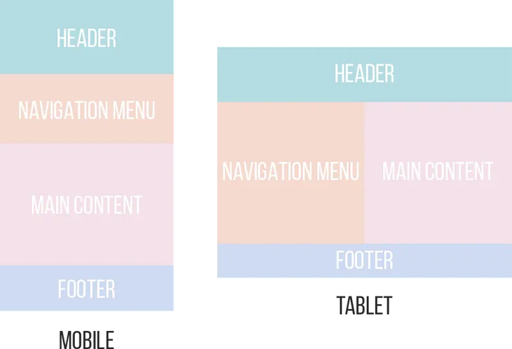
Let’s say you have the following layout that you want to integrate:

What it would be like with Bootstrap
<body>
  <div class="container">
    <div class="row">
      <div class="col-12 header">...</div>
    </div>
    <div class="row">
      <div class="col-4 navigation-menu">...</div>
      <div class="col-8 main-content">...</div>
    </div>
    <div class="row">
      <div class="col-12 footer">...</div>
    </div>
  </div>
</body>
Even though there are only four blocks, you needed nine different div to code your layout.
How much simpler it would be with CSS Grid
Thanks to CSS Grid, you can get the same result with only five div!
<body>
  <div class="container">
    <div class="header">...</div>
    <div class="navigation-menu">...</div>
    <div class="main-content">...</div>
    <div class="footer">...</div>
  </div>
</body>
Though it will not be as simple as just importing Bootstrap, you will have to add some extra CSS.
.container {
  display: grid;
  grid-template-columns: repeat(12, 1fr);
}
.header {
  grid-column: span 12;
}
.navigation-menu {
  grid-column: span 4;
}
.main-content {
  grid-column: span 8;
}
.footer {
  grid-column: span 12;
}
In the example above, you first defined the container as a 12-column grid.
And then, you set the number of tracks the item will pass through.
What about responsiveness?
Moreover you may want to have a responsive layout for smartphones and tablets.

With Bootstrap
As the design gets more complex, your HTML also gets more complex with more and more classes:
<body>
  <div class="container">
    <div class="row">
      <div class="col-xs-12 header">...</div>
    </div>
    <div class="row">
      <div class="col-xs-12 col-md-6 col-lg-4 navigation-menu">...</div>
      <div class="col-xs-12 col-md-6 col-lg-8 main-content">...</div>
    </div>
    <div class="row">
      <div class="col-xs-12 footer">...</div>
    </div>
  </div>
</body>
With CSS Grid
With CSS Grid, if you want to add responsiveness to your layout, there is no need to change the HTML.
You only need to add some media queries to our CSS stylesheet:
...
@media screen and (max-width: 768px) {
  .navigation-menu {
    grid-column: span 6;
  }
  .main-content {
    grid-column: span 6;
  }
}
@media screen and (max-width: 480px) {
  .navigation-menu {
    grid-column: span 12;
  }
  .main-content {
    grid-column: span 12;
  }
}
What if you wanted to move your blocks around?
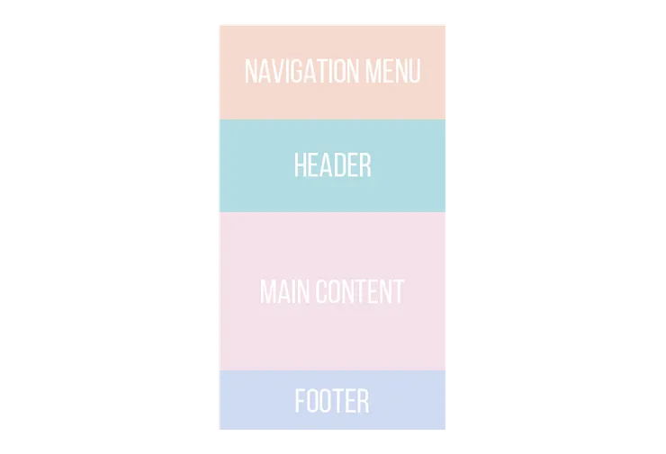
Let’s say that instead of the above layout on mobile, you wanted the navigation menu to be above the header:

With Bootstrap
You would have had to duplicate your menu, hide one and display the other on mobile and vice versa on desktop:
<body>
  <div class="container">
    <div class="row">
      <div class="col-xs-12 hidden-sm-up navigation-menu-mobile">...</div>
      <div class="col-xs-12 header">...</div>
    </div>
    <div class="row">
      <div class="col-md-6 col-lg-4 hidden-xs-down navigation-menu">...</div>
      <div class="col-xs-12 col-md-6 col-lg-8 main-content">...</div>
    </div>
    <div class="row">
      <div class="col-xs-12 footer">...</div>
    </div>
  </div>
</body>
And the HTML gets more and more complex as your layout grows.
With CSS Grid
You only need one single line of CSS to move the navigation menu to the top on mobile and here is how to do so:
...
@media screen and (max-width: 480px) {
  .navigation-menu {
    grid-row: 1;
    grid-column: span 12;
  }
  ...
}
Customize your grid layout!
Have as many or as few columns as you want
By default, Bootstrap comes with a 12-column grid system.
This value can be overridden but if you do so, it will be overridden everywhere in your app.
On the other hand, with CSS Grid, you can specify the number of columns per row for each of your grids.
In grid-template-columns: repeat(12, 1fr);, you can just set the number of columns you want instead of 12.
Unwanted 10-pixel paddings
Bootstrap’s columns have 10-pixel paddings on their right and left.
The most advised solution to override them is to use padding-right: 0 !important; and padding-left: 0 !important;.
As with CSS Grid you have control over all your CSS classes, you can set the paddings you want everywhere.
No more need to download any library
Even if Bootstrap’s stylesheet only weights a few kB, it still slows down the loading of your page.
All major browsers shipped their implementation of CSS Grid in 2017, so there is no need to download any extra CSS to use CSS Grid!
At the time of this article (April 2018), 89% of browsers are compatible with CSS Grid.

That’s all for now!
Here are some of the main reasons why I no longer use Bootstrap.
Part 2 on how I also managed to replace Flexbox with CSS Grid is coming!

