How to Synchronize your Style Guide from Figma to CSS in One Click
Adèle Gauvrit8 min read
I have set-up an automatic pipeline to share our design system’s style guide:
- from Figma with a homemade plugin on which our designers work
- to our web apps on which developers work
I’d like to share with you why I think this is awesome and how it will improve our collaboration. Then I’ll get into the technical details and explain how I set this up.
A bit of context
With one of our clients, we are working on standardizing styles across our different apps and creating a design system. We have several web projects:
- a landing page
- a web app where users can see their account info, manage it
- an extension where they have quick access to their info
Because these projects live on their own, design can get a bit hectic. Colors are similar but not quite the same, buttons have different looks…
That’s why we created a shared design library consisting of:
- shared components, with ready to use buttons, form elements that don’t need to be developed on each project
- a style guide defining the look and feel of the brand with colors, typography styles that should be used in all projects
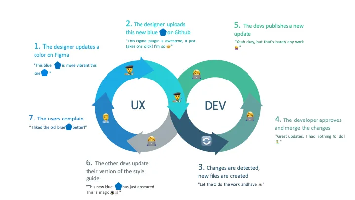
But once we had these, updating the style guide was a lot of repetitive work. That’s why I automated this process. Here is how it goes:
- On Figma, the designer adds a color or updates it
- Thanks to our homemade plugin, they send their changes to Github in one click in Figma
- A script is triggered automatically, generating automatically new files that can be used on all web projects
- A developer approves and merges the changes.
- They publish the shared library new version.
- Other projects developers upgrade their package. Colors are updated
Why share a style guide?
Creating a design system ensures that your product has consistency. This will strengthen your brand identity to your user and consistency will make it easier for the user to navigate through your familiar patterns. For instance, when submit buttons are always blue, the user knows what they do.
To implement this standard system in your code, you can centralize all your style variables in a stylesheet. Thus, you will improve your productivity by not having to decide what color to use. You don’t have to use your color picker to figure out what color this text should be or end up with 50 shades of blue in your project.
Why make this automatic?
Making this automatic makes things faster, more reliable. When you don’t spend time making tedious and repetitive chores, you have more time to focus your mind on solving problems and creating value.
Mostly it’s a great way to give ownership to designers over the style guide and its implementation. Unlike a regular process where they ask for a change, wait for the team to take the time to do those changes, here they push the changes and decide when it will be done.
How did I do this?
I wanted to share color from Figma via the shared design system library to every web projects in CSS format.

From a technical point of view, here is what I’ve done to implement this process:
- Develop a Figma plugin that:
- fetches the current colors on the shared component repository,
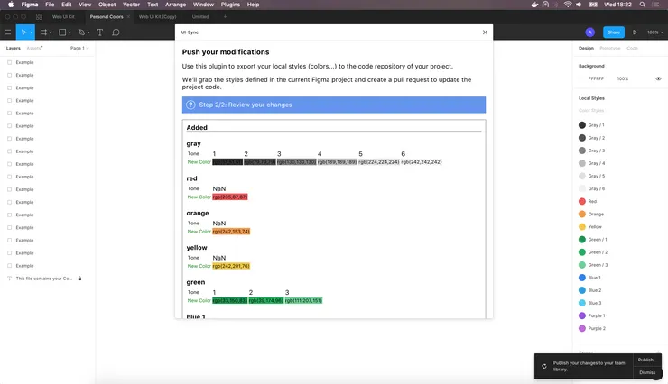
- compares them to the project’s colors and displays the difference to the designer
- opens a Pull Request thanks to the Github API
- Write a script with Handlebars templates and plop that creates a CSS file with color variables that can be used across all of our projects
- Launch this script in the repository’s CI so when the Pull Request is opened, the resources are created also.
Creating the Figma plugin
The Figma plugin aims to automatically export a project’s colors to the shared design system repository.
It shows the differences being updated and once the designer has validated them, opens a pull request on Github.
Building this plugin was made easy thanks to Figma’s documentation and automatic plugin generation tool directly integrated into the desktop app.
If you want to create your plugin, I have a few tips that could help you.
From your desktop app, in the plugin tab, you can create a one by choosing one of the templates:
- an empty project
- a project with no UI
- a project with a UI
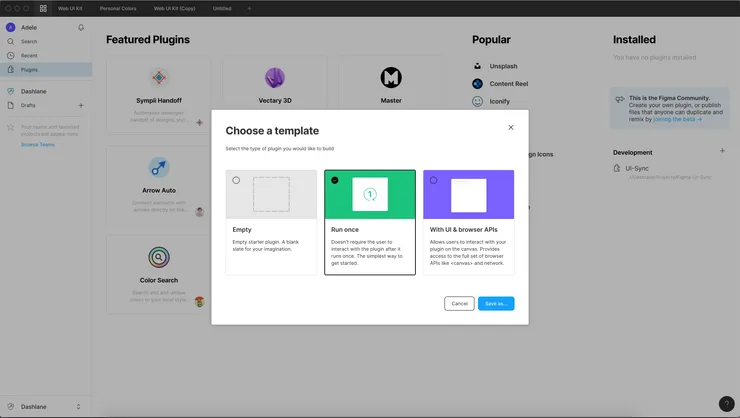
To choose between the last two, you may need to understand how a Figma plugin works. There are two parts: a sandbox and an iFrame
The background has access to Figma’s controller, this is where you can get information on a project, its components and change it. This controller is very well documented on Figma’s developer site and strongly typed if you are using Typescript.
The iFrame doesn’t have access to the controller but it has access to browser APIs.
If you don’t need any user inputs or feedback, you will only have a code sandbox but you won’t be able to access useful APIs or make HTTP requests
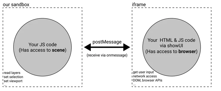
Source: Figma Developers https://www.figma.com/plugin-docs/how-plugins-run/
In this case, I chose to create a Plugin with a UI.
In the sandbox, I get the projects “paints” (which can be colors, gradient or images) and only keep the “SOLID” paints (the colors) :
const paintStyles = figma.getLocalPaintStyles();
const solidPaintStyles = paintStyles.filter(
  paintStyle => paintStyle.paints[0].type === "SOLID"
);
I then create an object containing the color names, variants, and values.
In the UI, I push a new commit to the repository with this object in JSON format to Github API endpoint. I have a function that does this API call:
    const updateColorsJsonContent = async (
      masterSha,
      newColorObject,
      branch,
      token,
      userName,
      userEmail
    ) =>
      await fetch(`https://api.github.com/repos/our-repo/contents/src/globals/colors.json`, {
        method: "PUT",
        headers: {
          Authorization: `token ${config.token}`
        }
        body: {
          message: "feat(sync): applying Figma colors update",
          content: window.btoa(JSON.stringify(newColor, null, 2)),
          branch,
          committer: {
            name: userName,
            email: userEmail
          },
          sha: masterSha
        }
      });
Finally, I open a new pull request so a CI build will be triggered and a developer can review and approve.
Creating shareable stylesheets
I share design alongside components in our design system, repository. In this library, I have decided to store colors in a JSON file.
I chose this format on the shared design library because it was an easy format to export.
But our web projects mostly use CSS for style. To bypass this, I use the CI to generate a stylesheet with new color variables.
I use Handlebars Template to generate this CSS style guide. Adding a color to a CSS file would look something like:
:root {
  --{{color-name}}: {{value}}
}
If I pass the template a color name “blue” and a value “#aaa”, I would get:
:root {
  --blue: #aaa;
}
In our case, our input is more complicated. Designers choose one main shade and derive it to several shades. It is an object shaped like this:
{
  "blue": {
    "1": "#aaa",
    "2": "#bbb"
  },
  "red": {
    "1": "#ccc",
    "2": "#ddd"
  }
}
To loop through each color and then through each variant, our template actually looks like this:
:root {
{{#each colorToken}} // loop through the color names
    {{#each this}} // loop through the color variants
    --{{@../key}}-{{@key}}: {{this}}; // add a color variable
    {{/each}}

{{/each}}
}
key and this refers to the current loop object key and value, in our case the color variant and value.
@../key refers to the parent loop key, the color name here.
As an output I get:
:root {
  --blue-1: #aaa;
  --blue-2: #bbb;

  --red-1: #ccc;
  --red-2: #ddd;
}
From there, it is easy to create a similar template and generate a variable file in SCSS.
To launch our templating process automatically, I use “plop” which is a command-line tool to call Handlebar from your terminal.
I am now ready to update automatically this resource in our CI when a change is detected on the colors.json file, i.e. when the designer has created a pull request with updated colors from Figma.
I chose the CI to execute this because:
- I am sure the CSS resources will always be up-to-date with the JSON
- I don’t want to overload our publishing process by adding this task
- I don’t want to do it in the plugin because I try to limit the logic as much as possible. The format which is used in the web project is very specific and can change. It is easier to deploy a new CI configuration than a new plugin.
Conclusion
I think we have a great process that will reduce the time for the designers to see their work deployed. I’ll see if our team of developers and designers enjoy the time gain and simplicity.
Automation is a great way for developers to collaborate with designers. If you are interested in that topic here are a few tools you should check out:
- Style Dictionary: an open-source project developed by Amazon that allows you to export your style variables into cross-platform formats for iOS, Android or web and maintain your style guide easily.
- Overlay: a tool we develop at Theodo, that allows a designer to export their components from Sketch and will generate React and Vue code.
I hope this article will make you want to create your design pipeline and work more closely with your designer!
