Write Better CSS: From Hell to Heaven (Part 1)
Albéric Trancart14 min read

Through my experiences, I encountered many fellow coworkers that found CSS code painful to write, edit and maintain. For some people, writing CSS is a chore. One of the reasons for that may be that they have never been properly taught how to write good CSS in the first place, nor what is good CSS. Thus it has an impact on their efficiency and on the code quality, which isn’t what we want. This two parts article will focus on:
- Part 1: What is good CSS code? (more precisely, what is not good CSS). I will focus on actionable tips and tricks to avoid creating technical debt starting now.
- Part 2: how to migrate from a complex legacy stylesheet to a clean one.
Warning: these are the guidelines that I gathered through my experiences and that worked well for many projects I worked on. In the end, adopt the methods that fit your needs.
Requirements
I assume that you are looking for advice to improve yourself at writing CSS, thus you have a basic knowledge of CSS and how it works. In addition, you will need these things:
A definition of done
You should be very clear about which browser/devices you want to support or not. You must list browsers/devices you want to support and stick to it. Here is an example of what can be a definition of done:
- Browsers: Chrome ≥ 63, Firefox ≥ 57, Edge ≥ 12
- Devices: laptops with resolution ≥ 1366*768
You must write this list with a business vision: maybe your business needs IE support because 20% of your users are using it. You can be specific for some features. For instance: the landing page should work on devices with small screens but the app behind the login should not.
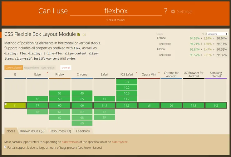
But if your Definition Of Done does not include IE9, do not spend unnecessary time fixing exotic IE9 bugs. From there you can use caniuse.com to see which CSS features are supported on your target browsers (example below).

A good understanding of what specificity is
Here is a quick reminder about what is specificity:
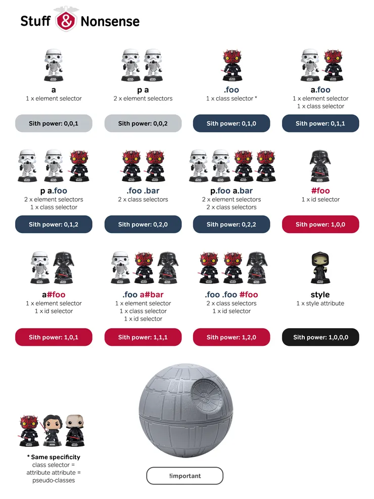
Specificity determines which CSS rule is applied by the browsers. If two selectors apply to the same element, the one with higher specificity wins.
The rules to win the specificity wars are:
- Inline style beats ID selectors. ID selectors are more specific than classes and attributes (
::hover,::before…). Classes win over element selectors. - A more specific selector beats any number of less specific selectors. For instance,
.listis more specific thandiv ul li. - Increasing the number of selectors will result in higher specificity.
.list.linkis more specific than.listand.link. - If two selectors have the same specificity, the last rule read by the browser wins.
- Although
!importanthas nothing to do with the specificity of a selector, it is good to know that a declaration using!importantoverrides any normal declaration. When two conflicting declarations have the!importantkeyword, the declaration with a greater specificity wins.
Here is a good website to compute the specificity of a selector: Specificity Calculator. Below is a chart to recap all these rules (taken from this funny post on specificity).

Some basic knowledge of preprocessors
Preprocessors are great because they allow you to write CSS faster. They also help to make the code more understandable and customizable by using variables. Here I will use a SCSS syntax in the examples (my favorite preprocessor but others like LESS/Stylus are pretty similar). An example of what you can do with preprocessors:
// vars.scss
$messageColor: #333;

// message.scss
@import "vars";
%message-shared {
  border: 1px solid black;
  padding: 10px;
  color: $messageColor;
}

.message {
  @extend %message-shared;
}
.success {
  @extend %message-shared;
  border-color: green;
}
Variables in CSS can now be done with native CSS but preprocessors still have the upper hand on readability/usability.
What you should not do
I will show you what you DON’T want to do and explain why such coding practices will lead to many problems over time.
Don’t write undocumented CSS
I put this point first because I believe it’s one of the most impactful things you can act on straightaway. Like any other language, CSS needs to be commented. Most stylesheets don’t have comments. And when I advise you to write comments, I don’t talk about this:
// Header style
.header {
}
Those are bad comments because they have no purpose and convey no additional information. A good CSS comment explains the intention behind a selector/rule. Here is an example of some good comments:
.suggestions {
  // 1 should be enough but in fact there is a Bootstrap rule that says
  // .btn-group>.btn:hover z-index: 2 (don't ask me why they did this)
  z-index: 3;
}

// Firefox doesn't respect some CSS3 specs on the box model rules
// regarding height. This is the only cross-brower way to do an
// overflowing-y child in a fixed height container.
// See https://blogs.msdn.microsoft.com/kurlak/2015/02/20/filling-the-remaining-height-of-a-container-while-handling-overflow-in-css-ie8-firefox-chrome-safari/
.fixed-height-container {
}
What should you comment on?
- CSS hacks
- Every line you didn’t write or you wrote 6 months ago (which is the same) where you needed more than 10 seconds to understand its intended purpose.
- Magic values. Speaking of which…
Don’t use magic values
The most common thing between developers resenting CSS is a general feeling of black magic. Put a rule here and an !important there, with a width value that looks good and it works. You see? Magic. But magic doesn’t exist. You should have a more scientific approach to demystify CSS. Writing good comments is one thing. Stopping writing magic values is another.
I define a magic value by “any value that looks weird, aka is not a multiple of 5” - even then some values may look weird. Examples of magic values are:
.mb-t-5 {
  left: 157px;
  height: 328px;
  z-index: 1501;
  font-size: 0.785895rem;
}
Why are these values problematic? Because again, they do not convey the intention. What is better:
- Using preprocessor variables which adds a meaning to a number.
- Make the exact calculation. If you wrote this value after some tests using the Chrome dev tools you may find out with a scientific approach that your initial “magic” value may not be the most accurate one.
- Commenting the value to explain why it’s here.
- Challenging your value/unit and changing it to a more pertinent one.
Example:
.understandable-class-name {
  left: calc(50% - ($width / 2));
  // An item have a 41px height:
  // 2*10px from padding+20px from line-height+1px from one border.
  // So to get 8 items in height:
  height: 8 * 41px;
  z-index: 1501; // Needs to be above .navbar
  font-size: 0.75rem;
}
Don’t use px units everywhere
Most hellish CSS stylesheets use px units everywhere. In fact, you should almost never use them. In most cases, pixels never is the good unit to use. Why? Because they don’t scale with the font-size or the device resolution. Here is a recap of which unit to use depending on the context. Quick cheat sheet:
- px: do not scale. Use for borders and the base font size on the
htmlelement. That’s all. - em, rem (> IE8): scale with the font-size. 1.5em is 150% of the font size of the current element. 0.75rem is 75% of the font size of the
htmlelement. Use rem for typography and everything vertical like margins and paddings. Use em wisely for elements relative to the font-size (icons as a font for instance) and use it for media query breakpoints. - %, vh, vw (> IE8): scale with the resolution. vh and vw are percentages of the viewport height and width. These units are perfect for layouts or in a calc to compute the remaining space available (
min-height: calc(100vh - #{$appBarHeight})).
I made a page for you to play with the base font-size and CSS units (open in a new window to resize the viewport and try changing the zoom setting).
Don’t use !important
You should keep your specificity as low as possible. Otherwise, you will be overriding your override rules. If you tend to override your styles, with time passing you will hit the hard ceiling - !important and inline style. Then it will be a nightmare to create more specific CSS rules.
Using !important is a sign that you’re working against yourself. Instead, you should understand why you have to do this. Maybe refactoring the impacted class will help you, or decoupling the common CSS in another class would allow you not to use it and lower your specificity.
The only times you should use it is when there is absolutely no other way to be more specific than an external library you are using.
Don’t use IDs as selectors
Keep. Your. Specificity. Low. Using an ID instead of a class condemn you to not reuse the code you’re writing right now. Furthermore, if your javascript code is using IDs as hooks it could lead to dead code (you are not certain whether you can remove this ID because it could be used by the JS and/or CSS).
Instead of using IDs, try to look up common visual patterns you could factorize for future reuse. If you need to be specific, add a class on the lowest level of the DOM tree possible. At the very least, use a class with the name you would have given to your ID.
// Don't
#app-navbar {
}

// Slighlty better
.app-navbar {
}

// Better (pattern that you could reuse)
.horizontal-nav {
}
Don’t use HTML elements as selectors
Again. Keep your specificity low. Using HTML tags as selectors goes against this because you will have to add higher-specificity selectors to overwrite them later on. For instance, styling the a element (especially the a element, with all its use cases and different states) will be an inconvenience when you use it in other contexts.
Don’t:
<a>Link</a>
<a class="button">Call to action</a>
<nav class="navbar"><a>Navbar link</a></nav>
a { ... }
.button { ... }
// Because you will have to create more specific selectors
a.button { ...overrides that have nothing to do with the button style... }
.navbar a { ...same... }
Better:
<a class="link">Link</a>
<a class="button">Call to action</a>
<nav class="navbar"><a class="navbar-link">Navbar link</a></nav>
.link { ...style of a link, can be used anywhere... }
.button { ...style of a button, idem... }
.navbar-link { ...style of a navbar link, used only in navbars... }
However, there are some cases when you could use them, for instance when a user wrote something like a blog post that is output in pure HTML format (therefore preventing you from adding custom classes).
// Don't
ul { ... }

// Better
%textList { ... }
.list { @extends %textList; }
.user-article {
    ul { @extends %textList; }
}
Furthermore, HTML should be semantic and the only hooks for style should be the classes. Don’t be tempted to use an HTML tag because it has some style attached to it.
A side-note on the ideal specificity
You should aim for a specificity of only one class for your CSS selectors.
The best part in Cascading Style Sheets is “cascading”. The worst part in Cascading Style Sheets is “cascading” — The Internet
The whole thing about CSS is that you want to make your style the same everywhere (therefore it needs to be reusable) AND you want to make it different in some unique places (therefore it needs to be specific). All CSS structure issues are variations of this basic contradiction.
Opinion: The Cascading effect of CSS can be a great tool and it serves a purpose: to determine which CSS declaration is applied when there is a conflict. But it is not the best tool to solve this problem. What if instead, there were no conflicts on CSS declarations, ever? We wouldn’t need the Cascade effect and everything would be reusable. Even “super-specific” code can be written as a class that will be used only once. If you use selectors of only one class, you will never need to worry about specificity and overwriting styles between components.
“But that could lead to a lot of duplicated source code”, you could say. And you would be right if there were no CSS preprocessors. With preprocessors, defining mixins to reuse bits of CSS by composition is a great way to factor your code without using more specific selectors.
There is still a concern over performance because the output stylesheet is bigger. But for most stylesheets/projects, CSS performance is irrelevant over javascript concerns. Furthermore, the advantage of maintainability far outweighs the performance gains.
If we try to combine the last three Don’ts, this is how I would take this code:
<main id="main_page">
  <p><a>Some link</a></p>
  <footer>
    <a>Some other link</a>
  </footer>
</main>
a {
  cursor: pointer;
}

#main_page {
  a {
    color: blue;

    &:hover {
      color: black;
    }
  }
}

footer {
  border: 1px solid black;

  a {
    color: grey !important;
  }
}
And turn it into this:
<main>
  <p><a class="link">Some link</a></p>
  <footer class="footer">
    <a class="footer-link">Some other link</a>
  </footer>
</main>
.link {
  cursor: pointer;
  color: blue;

  &:hover {
    color: black;
  }
}

.footer {
  border: 1px solid black;

  &-link {
    // You can use a mixin here if there is a need to factor in
    // the common code with .link
    cursor: pointer;
    color: grey;
  }
}
What you can do right now
Do try to understand how CSS declarations really work
There are some declarations you really want to understand. Because if you don’t there will still be a feeling of “black magic” happening.

vertical-align: middle; margin: 0 auto; all the things!
What you should know (tip: if you think you would not be able to explain it clearly to someone else, click the links):
- The box model (width, height, padding, margin, border, box-sizing, display: block/inline/inline-block).
- Positioning and positioning contexts (position: static/relative/absolute/fixed, z-index).
- Typography (font-size, font-weight, line-height, text-transform, text-align, word-break, text-overflow, vertical-align)
- Selectors (*, >, +, ::before, ::after, :hover, :focus, :active, :first-child, :last-child, :not(), :nth-child())
Bonus ones to go further:
- A complete guide to tables
- Transitions
- Shadows & filters
- Floats (only if you have to. My advice would be: don’t use floats).
Do look at Flexbox and Grid
If your Definition of Done doesn’t include older browsers and you don’t use/know the flexbox and/or grid model, it will solve a lot of your layout problems. You may want to check these great tutorials:
- A complete guide to Flexbox (Chrome ≥ 21, Firefox ≥ 28, IE ≥ 10, Safari ≥ 6.1)
- A complete guide to Grid (Chrome ≥ 57, Firefox ≥ 52, IE ≥ 10, Safari ≥ 10.3), a short example of grid use
Do look at BEM and CSS modules/styled components and apply it to new components
You should use CSS guidelines such as BEM. It will make your code more maintainable/reusable and prevent you from going down into the specificity hell. Here is a great article on BEM which I recommend.
Furthermore, if you have a component-based architecture (such as React, Vue or Angular), I recommend CSS modules or styled components to remove the naming hassle of BEM (here is an article on the whole topic).
Opinion: there is one main gotcha with these tools. You may believe that the auto-scoping feature of these tools acts as a pseudo-magic protection. However, beware that you should not bypass the above Don’ts. For instance, using HTML elements in CSS modules selectors destroys the purpose of auto-scoping because it will cascade to all children components. You should also keep a strict BEM-like approach (structuring your component styles into blocks, elements, and modifiers) while using these kinds of tools.
Do challenge and remove useless CSS
A lot can be done by using only seven CSS properties. Do challenge CSS that does not seems essential. Is this linear-gradient background color essential when nobody sees the gradient effect? Are those box-shadow declarations really useful?
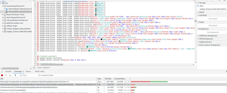
You can also find unused CSS with Chrome’s CSS coverage. In the “More tools” drop-down, activate the “Coverage” tool, start recording and crawl your target pages. Here is an example showing that many classes are never used, as well as 85% of the whole stylesheet.

Do it yourself
A note on frameworks like Bootstrap and others: they are useful for small and quick projects when you don’t have time to dedicate to style. But for many medium-sized and a lot of large-sized projects, don’t use them.
Over time, you will need to overwrite them and it will eventually take more time than doing it yourself because it will produce a more complex and more specific code.
In addition, doing your style yourself makes you learn a lot. UI designer is a whole job so creating a UI from scratch is a real challenge. At first, try to reproduce the same look and feel than other websites you like (you can look at the code with the browser dev tools). My personal experience is that I started to love and learn CSS the moment I threw Bootstrap out the window for a personal project and started writing my own style.
I hope that with all the above best practices you will feel more comfortable writing CSS and that it will help you enhance your code quality. In Part 2 I will address the hassle of migrating a hellish complex stylesheet full of black magic to a clean, understandable and maintainable one. So don’t hesitate to share your CSS horror stories!


