Everything You Always Wanted to Know About CSS (but were too afraid to ask)
Louis Zawadzki5 min read

Do you sometimes try position: relative then absolute then relative again?
Does it take you more than 2 seconds to decide whether you’re going to use padding or margin?
Have you ever added more than 5 classes to make your CSS work?
If you said yes to one of these questions don’t be ashamed, you’re not alone.
But don’t be afraid, acquiring those skills is a lot easier than you probably think.
Relative or Absolute? Find the reference of your movement!

The position attribute has 5 different values: static, relative, absolute, fixed and sticky.
Whereas fixed is quite straightforward and sticky is still barely used as its support is still limited, many developers struggle to use relative and absolute on point.
So let’s dig into the differences between these positions and find an easy rule to decide which one to use.
If you want to experiment with static, relative and absolute positions, I’ve made a Codepen on purpose.

Perhaps even Albert Einstein hesitated between relativity and absolutivity
Static
That one is the default value.
It will add it to the flow as it is defined by other propopreties such as display, margin or padding.
If you try to use top, bottom, left or right it will have no effect.
Relative
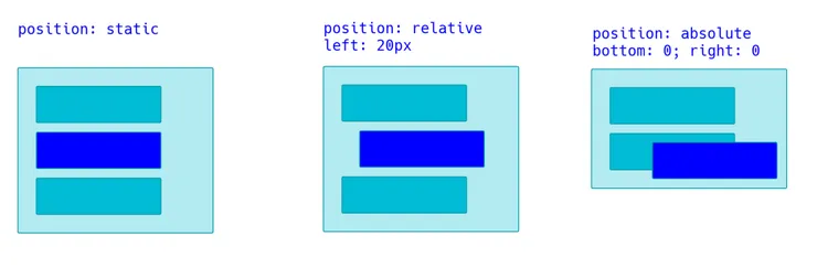
position: relative will move the element from the position it would have had, had it been positionned with static.
So using left: 20px will move your element 20 pixels on the left from its static position.
One more thing to notice is that elements around will behave as if its position were static.
Absolute
If you use top: 0 and left: 0;, your element will go on the top left corner of its first non static parent element.
Be careful: if the element’s parent’s position is static, it won’t be the reference!
If you want to make it the reference, there’s one simple trick : using position: relative for the parent ;)
Also, all its siblings and parent elements will behave as if it didn’t exist.
So, how to decide over relative or absolute?
The key is to identify the reference for the position.
position: relative is to be used when you want to move an element from its static position.
When you want to move your element inside its parent, then position: absolute is the best choice.
Margin or Padding? Imagine your element was clickable!

When you want to set spaces between elements in CSS you can either use margin or padding.
The 4 main differences between the 2 properties are:
marginis applied outside the border of an element, whereaspaddingis applied inside- the
paddingzone of an element is clickable if the element is clickable, themarginzone is not - the
paddingzone of an element has the same background color as the element, themarginzone the same as the element behind - vertical
marginvalues collapse - unless one of your elements is positionned with absolute or floating - see this Codepen
So, how to choose between the two?
Well if the element I want to space has borders, it is pretty easy to find out: if the space is outside the borders then I use margin, otherwise I use padding.
But when it’s not the case, I ask myself:
If the element was clickable, could I click on the space?
Or its variant: If the element had a background color, would the space had the same?
If so then I use padding!
How many classes do I need to add? Know the rules of specificity!
Let’s say I want to center a paragraph, inside a div which has a class called intro. I could write it like:
.intro p {
  text-align: center;
}
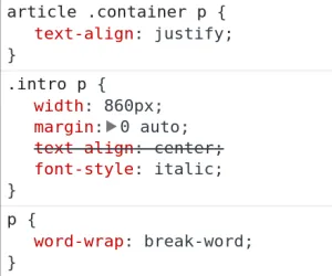
But sometimes it would not work, and when I opened my Dev Tools I would see this:

Crap! Looks like Chrome has decided to take another rule before mine!
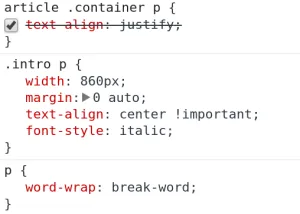
How can I override this? Well, there are some lazy ways: put !important which basically overrides everything, or put it as inline CSS.

But it is a bad idea to use !important, because if you want to override this rule later, well, you’ll have no choice but to add an !important (and then, nothing becomes important anymore…).
So how can I apply my new CSS rule?
To decide which rule to apply over another, Chrome uses the specificity of each rule.
Here is a simplified way of how it works:
- the rule with the more ids wins
- e.g. #lean > **.**waterfall
- if there is a draw, the rule with the more classes wins
- e.g. .scrum .agile > li.stock
- if there is a draw, the rule with the more tags wins
- e.g. ul****li a.improvement > p.rework a
- if there is a draw, the rule declared last in the stylesheet wins
Final Word
I’ve met a lot of web developers who understand closures, functional programming, lambda calculus or who can retro-engineer APIs, package applications with Webpack in their sleep or even code efficiently with Vim.
Yet, these briliant people were completely naked when it came to centering a button on a page.
Is it because it is super hard to do? Certainly not.
Is it because they’re not clever enough? Probably not.
I can’t tell for them, but I can tell for myself. For a long, long time I assumed CSS was easy, and not worth spending time to study it in depth. I even felt a bit ashamed every time I googled something about style. But it’s not because something is simple that you should not try to master it. On the contrary, it takes only a few minutes to understand some subtleties and that can save you a lot of pain.
There’s still a lot you can learn about CSS in the next minutes like why it does not make any sense to use z-indexes over 10 in most applications, how float works or you can get into flexbox if you’ve got more time.
If you liked this article or you know fellow developers who might learn some tricks from it please share it, and leave a comment below if you think it can be improved!

