How Web Developers Can Be Excellent Web Designers
Loïc Gelle6 min read
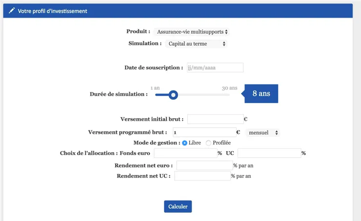
You want to know how you can move from this design…
…to this new one
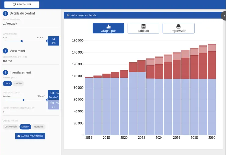
in two weeks in your project?
This article aims at giving you precise guidelines on how to build a custom-made interface without any - conscious - prior knowledge of design.
Let’s get started!
1. Spot the Need
A great design is a design led by a real user need in terms of ergonomy. Making a gratuitous ergonomy is a waste of time for your project.
A good ergonomy need can be expressed this way: “As a user, I can…”. The more precise the user’s need is, the better the resulting design is.
The website TrainLine is a great example of ergonomy that was built towards one precise and motivating user need: “As a user, I can book a train ticket in less than one minute”. Such a good need is essential as it drives the designing and the development processes all the way.
There are two options to get a user need:
- if you have had the opportunity to meet the users or to get user feedbacks, take them into account to define with your client a precise user need;
- if you couldn’t reach the users, don’t panic! Make multiple hypotheses on different user needs and use cases and build different designs based upon them.
2. Analyse the Need
Now that you are focused on precise use cases and ergonomy goals, it is time to analyse your application’s features and components with respect to those.
Plan a “design workshop” of approximately half a day. The expected output is a document you will give to your client, just like this one:
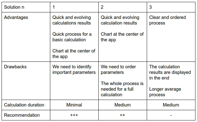
- improvement points that you spotted about the existing ergonomy: misplaced buttons, lacking functionality…
- design proposals that state the hypotheses made about user needs, the global behaviour of the application on a use case - “this panel opens when I click that button…” - and screenshots of model applications, if possible
- a comparison table in which you mention the development complexity, the advantages and drawbacks of each solution along with the opinion of the development team about the most adapted solution.
Ask your fellow developers their opinion about the usability of this or that component, the position of this panel, existing model applications that they possibly know about that would be a great source of inspiration for your design - do not hesitate to use screenshots! You may be surprised: in a way, a web developer is a user experience specialist as they spend their time surfing on the Internet and making web applications. If you have any doubt about that, don’t hesitate to show your current application around you: you will get a bunch of usability feedbacks.
Think about the UX library you want to use. I personally love Google Material, and its specifications are very useful to build your design if you are not sure of where to position a panel or which size should a button be.
Keep in mind that you want something that is both pretty and usable. To avoid creating beautiful but useless components - a slider that only allows the user to choose between the two extremal values, for instance -, always think as if you were a user of the application, in terms of use cases.
3. Prepare Your Design
The document that you just sent to your client is certainly of great value, but now your client wants a glimpse of what his application could look like. This is the moment you can really create value and convince your client. According to a client that I had on a project:
What helped us the most during the design workshop were the templates and the fact that we could adjust things live together.
What you have to do is transform what you said in the previous document in images. Several tools can help you do that:
- Software like Moqups are great for they allow you to pick components from famous libraries - such as Material and Bootstrap -, customize them to your needs and integrate them in your templates.
- More generic tools like Photoshop or Gimp also do the trick if you are used to them, although the exercise is a little bit different. I suggest taking screenshots of the components and pasting them into your image document according to your needs. I personally use React Toolbox whose website features a playground for each component, in which you can customize your component’s behaviour and appearance before you copy it to your document. If the library that you want to use does not come with that kind of playground, you can tweak the component directly using the Chrome inspector.
What you want to do is showing not only the components you want to use, but also how they come together in your ergonomy. Here is an example of what you can do with Moqups:
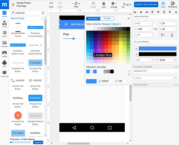
Focus on components: unlike webdesigners, you know the libraries you can use to design your application, which makes it easy for you to estimate how much it will cost to your client to transform the application ergonomy.
Prefer using an existing and reusable component rather than creating one from scratch. Of course your client may have specific needs, but sometimes there is a good reason why an awkward custom-made component does not exist…
Prepare yourself to edit your design “live”. When you meet your client or the users, it is very useful to discuss the design while editing it live. This way you can adjust the ergonomy to the user’s need.
4. Convince Your Client
You are now ready to show your work to your client.
Set up a workshop with the main members of the project - your client and the stakeholders - and the people who may have an influence over your design - users of course, but also marketing.
You will take the lead for the first part of the workshop: show your templates and explain the choices you made in terms of ergonomy.
Do not hesitate to show the behaviour of your components: the animations of your graphs or inputs are always a good way to impress people and bring life into your design.
You can then discuss details with the stakeholders and the users.
Write down their feedbacks and adapt your design to their needs: play with your templates to give your users live results of their ideas.
5. Develop and iterate
At this moment the best is yet to come and you made the hardest part of the work. Turning your design templates into development tickets should now be quite easy.
- Try to create the smallest development tickets: adding a button, moving an input from one panel to another or adding a header are features without uncertainty that you can easily estimate.
- Always keep in mind that your application has to stay functional throughout the process: building a new ergonomy is a waste of time if you loose the features, even temporarily.
The most important thing is to continuously incorporate improvement in your ergonomy. Reach the users as often as you can to get their feedback: this way you can iterate over the process to create an application that fits the user’s needs perfectly.
